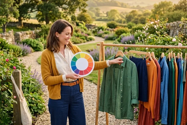
Choosing colours for an outfit can feel strangely difficult. You may love a green shirt and own a beautiful red bag, yet feel unsure whether they should ever appear in the same look.
This is where the colour wheel becomes useful. It shows how different hues relate to one another, making it easier to create combinations that feel calm, coordinated, bold, or playful.
Learning how to use the colour wheel when choosing clothes does not mean following strict rules. You will not need to carry a wheel every time you go shopping or stop wearing a combination simply because it breaks traditional colour theory.
Instead, the wheel gives you a practical starting point. It can help you understand why navy and orange create strong contrast, why blue and green often feel harmonious, and why several shades of brown can produce a polished outfit.
Once you understand a few basic relationships, you can coordinate your wardrobe more confidently while still developing a colour style that feels personal.
What Does the Colour Wheel Show?
The colour wheel is a circular arrangement of hues. It makes colour relationships easier to see because similar shades appear close together, while contrasting colours sit farther apart.
A traditional beginner’s wheel usually begins with the primary colours red, yellow, and blue. Combining them creates the secondary colours orange, green, and purple. Further mixing produces tertiary shades such as red-orange, blue-green, and yellow-green.
Design tools commonly use the wheel to create monochromatic, analogous, complementary, split-complementary, and triadic colour harmonies. These relationships can also be applied to clothing and accessories.
You do not need to identify every exact hue. Being able to recognise the general colour families is enough to begin building better combinations.
Start With One Main Colour
The easiest way to use the colour wheel is to begin with one garment you definitely want to wear. This becomes your anchor colour.
Imagine that your starting piece is a forest-green shirt. You can now look at the wheel and decide whether you want the rest of the outfit to feel subtle, closely coordinated, or highly contrasting.
For a calm look, you might pair the shirt with darker and lighter greens. For gentle variety, you could add blue or yellow-green. For stronger contrast, you might introduce a shade from the red family.
The main colour should usually occupy the largest visual area. Your supporting shades can appear in trousers, jackets, shoes, jewellery, belts, scarves, or bags.
Starting with one colour prevents you from trying to coordinate every item at the same time. It turns outfit building into a simple sequence rather than a guessing game.
Create an Easy Monochromatic Outfit
A monochromatic outfit uses one main hue in different shades, tints, or tones. It is one of the most beginner-friendly approaches because the colours naturally belong together.
For example, you could combine a pale blue shirt, medium-wash jeans, and a navy jacket. A brown outfit might include a cream top, camel trousers, dark-brown shoes, and a tan bag.
The pieces do not have to match exactly. In fact, slight differences often make the outfit look more interesting.
Add Variety Through Texture
When most of your outfit comes from one colour family, texture becomes important. Combining denim, cotton, knitwear, suede, linen, or leather stops the look from appearing flat.
You can also vary the proportions. A dark shade may form the base of the outfit, while a lighter version is worn closer to the face.
Monochromatic styling is useful when you want a polished outfit without introducing several competing colours. It can also make getting dressed easier because many pieces in the same family will coordinate naturally.
Use Analogous Colours for Gentle Harmony
Analogous colours sit beside one another on the colour wheel. Examples include blue and green, red and orange, or yellow and yellow-green.
Because these colours are closely related, they usually create a smooth visual transition. Adobe and the Interaction Design Foundation identify analogous palettes as established forms of colour harmony.
A practical combination might include navy trousers, a teal shirt, and a green bag. Another could pair an orange-brown skirt with a muted red top.
The colours do not need to be bright. Mustard, olive, and rust form an analogous palette that feels softer and easier to wear than vivid yellow, green, and orange.
For a balanced outfit, allow one colour to dominate and use the neighbouring hue in a smaller amount. This creates variety without making the look feel busy.
Try Complementary Colours for Bold Contrast
Complementary colours sit opposite each other on the colour wheel. Common pairs include blue and orange, red and green, and yellow and purple.
These pairings produce strong visual contrast. Adobe describes complementary schemes as combinations built from colours placed directly opposite one another on the wheel.
Wearing both colours at maximum brightness can create a dramatic outfit. However, beginners can make the combination more wearable by changing the shades or proportions.
Instead of bright blue with vivid orange, try navy trousers with a rust-coloured top. Replace strong red and green with burgundy and olive. Pair a lavender shirt with a muted mustard bag rather than combining deep purple and bright yellow.
Use the 80-20 Approach
Let one colour cover most of the outfit and use its complement as an accent. A mostly blue outfit might feature orange shoes, a belt, or a patterned scarf.
This approach gives you the energy of a complementary palette without making the two colours compete equally for attention.
Neutral pieces can soften the result further. White, denim, grey, beige, or black can create breathing room between contrasting shades.
Experiment With Split-Complementary Colours
A split-complementary combination begins with one main colour. Instead of using the colour directly opposite it, you select the two hues positioned on either side of that opposite colour.
Suppose your main garment is blue. Its direct complement is orange, so a split-complementary outfit could combine blue with red-orange and yellow-orange.
This scheme still provides noticeable contrast, but it can feel more flexible than a direct complementary pairing. You might wear blue jeans, a rust shirt, and a mustard accessory.
You do not have to use all three colours in equal amounts. Choose one dominant shade, a secondary colour, and a much smaller accent.
Split-complementary styling is useful when two-colour outfits feel too simple but a full multicolour look seems intimidating.
Build a Triadic Colour Combination
Triadic colours are spaced relatively evenly around the wheel. Red, yellow, and blue form a familiar example, as do orange, green, and purple.
These combinations can look energetic and creative. However, three highly saturated colours in equal amounts may feel overwhelming in an everyday outfit.
The solution is to adjust the intensity. You could combine navy trousers, a burgundy top, and a mustard bag. Although the shades are darker and softer, they still reflect a triadic relationship.
Another method is to let one colour dominate, use the second in a smaller garment, and reserve the third for an accessory. For example, an olive dress could be styled with a muted purple jacket and a small orange detail.
The colour wheel provides the relationship, but you control the brightness, proportions, and mood.
Use Neutrals to Make Colour Easier
Neutral colours do not always appear prominently on a basic colour wheel, but they play an essential role in wearable outfits. Common neutrals include black, white, grey, cream, beige, brown, navy, khaki, and denim.
A neutral base allows one colourful garment to become the focus. A pink shirt, for instance, may be easier to style with grey trousers and white trainers than with several additional bright colours.
Neutrals also have undertones. Cream, camel, and warm brown often coordinate smoothly, while crisp white, charcoal, and black can create a cooler, sharper appearance.
Black became especially influential in modern fashion through designers such as Gabrielle Chanel, although its popularity developed through a much broader cultural history.
The V&A notes that Chanel’s continued use of black helped establish the little black dress as a lasting wardrobe idea.
Use neutrals as a supporting structure rather than assuming they must always be the safest or most stylish choice.
Consider Brightness, Warmth, and Saturation
Two colours can belong to compatible families and still feel awkward together when their levels of intensity are very different.
Saturation describes how vivid or muted a colour appears. Electric green is highly saturated, while sage green is soft and greyed. Outfits often feel cohesive when the selected colours have similar intensity.
Pastel pink, pale blue, and soft yellow work naturally together because all three are light and gentle. Burgundy, forest green, and navy create a similarly balanced group at a darker level.
You should also consider temperature. Reds, oranges, and yellows usually feel warm, while blues, purples, and many greens appear cooler. Individual hues can still lean in different directions: tomato red feels warmer than berry red, for example.
Colour meanings are not permanent or universal. The V&A’s history of pink menswear demonstrates how cultural associations with clothing colours can change across different periods.
Personal preference, lighting, fabric, culture, and context all influence how a colour combination is perceived.
Practise With Clothes You Already Own
You do not need to shop for an entirely new palette. Begin by selecting one colourful garment from your wardrobe and creating three different outfits around it.
First, pair it with lighter or darker versions of the same colour. Next, combine it with a neighbouring hue. Finally, try its complementary colour through one small accessory.
Take photographs of each outfit in natural light. Photos make it easier to compare colour balance, proportions, and intensity than relying only on a mirror.
Notice which combinations make you feel comfortable and which ones seem too quiet or too bold. The goal is not to find a technically perfect outfit. It is to learn how much colour and contrast you personally enjoy.
With regular experimentation, you will begin recognising useful combinations without needing to consult the wheel every time.
The colour wheel can make choosing clothes feel less confusing by showing how different hues relate to one another.
Monochromatic and analogous combinations offer easy harmony, while complementary, split-complementary, and triadic palettes create stronger contrast and variety.
Neutrals can make bright colours more wearable, while saturation, temperature, and proportion help determine whether an outfit feels balanced. These principles are guides rather than fixed fashion laws.
Choose one colourful item from your wardrobe today and create three new combinations around it. Begin with a simple palette, adjust the intensity, and use accessories to test bolder contrasts.
The more you experiment, the easier it will become to choose colours confidently and develop combinations that genuinely reflect your personal style.