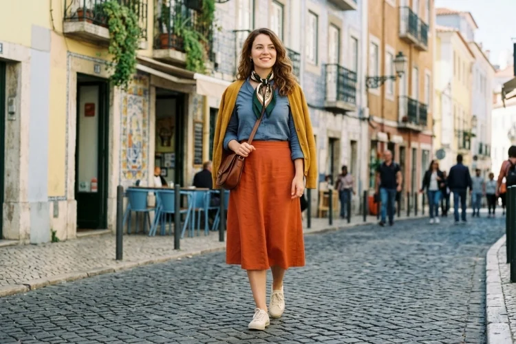
Have you ever put on two colours that looked great separately but somehow felt strange together? Or perhaps you avoid colourful clothes completely because black, white, and denim seem easier and safer.
Understanding colour theory for fashion beginners can remove much of that uncertainty. Colour theory is a practical framework for seeing how colours relate to one another.
It can help you build balanced outfits, use brighter shades without feeling overwhelmed, and create a wardrobe that is easier to coordinate. However, colour theory is not a collection of strict fashion rules.
You are still free to wear unexpected combinations, ignore traditional advice, or choose colours simply because they make you happy. The theory is there to explain why certain combinations feel calm, dramatic, playful, or visually balanced.
You also do not need to memorise an entire colour wheel. Once you understand a few basic ideas-such as hue, intensity, contrast, and colour harmony-you can make more confident outfit decisions using clothes you already own.
What Is Colour Theory in Fashion?
Colour theory explains how colours are organised, combined, and perceived. Artists, designers, photographers, and fashion professionals use it to create visual harmony, contrast, emphasis, and mood.
In fashion, the principles apply to everything you wear, including shirts, trousers, dresses, shoes, jewellery, bags, patterns, and makeup. Even an outfit built entirely from neutral shades involves decisions about warmth, contrast, and intensity.
Adobe’s colour wheel organises colours according to their relationships and can generate common harmonies such as monochromatic, analogous, complementary, and triadic palettes.
Colour theory cannot tell you which outfit is objectively “correct.” Instead, it gives you a starting point. Once you understand the relationships, you can follow them closely or break them deliberately.
Understanding the Colour Wheel
The colour wheel arranges different hues in a circle, making it easier to see which colours are related and which create strong contrast.
Many beginner-friendly colour wheels begin with three primary colours: red, yellow, and blue. Combining these creates secondary colours—orange, green, and purple. Mixing primary and secondary colours produces tertiary hues such as red-orange, yellow-green, and blue-purple.
The wheel is helpful because the position of each colour suggests possible outfit combinations. Colours beside one another usually create a smooth effect, while colours on opposite sides produce stronger contrast.
Hue, Tint, Shade, and Tone
A hue is the basic colour, such as blue, red, or green. A tint is created by making a colour lighter, while a shade is a darker variation.
A tone is a softened or less intense version of a hue. Olive, dusty rose, muted teal, and soft lavender are common examples of colours that feel less vivid than their brightest forms.
These differences matter when styling clothes. Bright red and deep burgundy belong to the same general colour family, but they create very different moods. One feels energetic and noticeable, while the other may appear richer and more understated.
Start With Monochromatic Outfits
A monochromatic outfit uses one main colour in different tints, shades, or tones. It is one of the easiest colour schemes for fashion beginners because the pieces already share a visual connection.
You could combine a pale blue shirt with medium-blue jeans and a navy jacket. Another option might include a cream top, beige trousers, and a dark brown bag. Although the colours are not identical, they belong to a closely related family.
The secret is to vary the texture and depth. Wearing exactly the same flat shade from head to toe can sometimes feel like a uniform. Combining denim, cotton, knitwear, leather, or linen adds visual interest.
Monochromatic dressing can also create a clean, continuous silhouette. If a full single-colour outfit feels too bold, begin with two related garments and add neutral shoes or accessories.
Use Analogous Colours for Easy Harmony
Analogous colours sit next to one another on the colour wheel. Examples include blue with blue-green, red with red-orange, or yellow with yellow-green.
Because these hues are closely related, they usually create a calm and cohesive combination. Adobe identifies analogous palettes as one of the main colour harmonies used to build structured schemes.
For a wearable outfit, choose one colour as the main shade and use the neighbouring colour as an accent. You might wear navy trousers with a teal blouse or combine an orange dress with a red bag.
You do not need to use the brightest versions. Muted rust, mustard, and olive form an analogous combination that feels softer and more practical than vivid orange, yellow, and green.
Using colours with a similar level of intensity usually produces the smoothest result. A highly fluorescent shade may dominate several muted pieces unless that contrast is intentional.
Try Complementary Colours for Strong Contrast
Complementary colours sit opposite each other on the wheel. Common pairs include blue and orange, red and green, or yellow and purple.
These combinations create noticeable contrast because the colours are visually different. Adobe describes complementary colours as hues positioned directly opposite one another on the colour wheel.
Wearing both colours at full intensity can create a bold statement. For a more subtle outfit, let one colour dominate and use the other in a smaller detail.
For example, you could wear a navy outfit with a rust-coloured bag, an olive dress with burgundy shoes, or a purple top with a soft yellow scarf. Darker, lighter, or muted variations make complementary colour combinations easier to wear.
The proportions do not need to be equal. A small orange accessory can provide enough contrast against a mostly blue outfit.
Experiment With Triadic and Split-Complementary Palettes
A triadic colour scheme uses three colours spaced relatively evenly around the colour wheel. A familiar example is red, yellow, and blue.
Triadic outfits can feel lively and creative, but using three strong colours in equal quantities may become visually busy. A beginner-friendly approach is to choose one dominant colour, one supporting shade, and one small accent.
You might wear navy trousers, a muted red shirt, and a mustard bag. The combination follows a triadic relationship without looking like a costume.
A split-complementary palette offers another useful option. Instead of combining one hue with its direct opposite, it uses the two colours beside that opposite hue.
For instance, blue could be combined with red-orange and yellow-orange. This creates contrast while often feeling slightly softer than a direct blue-and-orange pairing.
Learn How to Use Neutral Colours
Neutral colours are the foundation of many practical wardrobes. They commonly include black, white, grey, navy, beige, cream, brown, khaki, and some denim washes.
Neutrals are easy to combine, but they are not all identical. Some have warm undertones, while others appear cool.
Cream, camel, tan, and warm brown often coordinate naturally. Crisp white, charcoal, black, and cool grey create a sharper palette. Mixing warm and cool neutrals can also work, but the contrast should look intentional.
Fashion history provides famous examples of limited neutral palettes. Gabrielle Chanel regularly used beige, black, and white, while the little black dress became one of the house’s best-known contributions to modern fashion.
Use neutrals as a base when introducing a new colour. A bright green shirt may feel easier with blue jeans and white trainers than with several competing hues.
Consider Colour Temperature and Undertones
Colours are often described as warm or cool. Reds, oranges, and yellows generally feel warm, while blues, greens, and purples are commonly associated with cooler palettes.
However, individual colours can have different undertones. A tomato red has a warmer orange influence, while a berry red contains more blue. Olive is a warm green, whereas emerald often feels cooler.
You may notice that certain undertones coordinate more easily with your existing wardrobe. Someone who owns many cream, tan, rust, and brown pieces may naturally prefer warmer colours. A wardrobe dominated by black, grey, icy blue, and crisp white may lean cooler.
You can also consider how colours look beside your skin, hair, and eyes, but avoid treating seasonal colour analysis as an unbreakable rule. Lighting, fabric texture, makeup, personal preference, and the distance of a colour from your face can all change the effect.
Test garments in natural daylight when possible. If you love a colour but dislike it near your face, use it for trousers, shoes, bags, or other accessories.
Think About Saturation and Contrast
Saturation describes how vivid or muted a colour appears. Electric blue is highly saturated, while dusty blue is softer and greyer.
Outfits often feel coordinated when the colours share a similar intensity. Pastel pink, soft blue, and pale yellow can sit comfortably together because all three are light and gentle. Deep burgundy, forest green, and navy work for a similar reason.
Contrast also affects the mood. Black and white create a strong difference, while beige and cream produce a low-contrast look.
High-contrast outfits tend to appear bold, crisp, or dramatic. Low-contrast combinations can feel relaxed, elegant, and understated. Neither is better; the choice depends on your personality and the impression you want to create.
Colour meanings are also shaped by history and culture. The V&A notes that pink was once freely worn by fashionable European men before becoming strongly associated with femininity during the 20th century.
Build a Practical Wardrobe Colour Palette
A useful personal palette does not need to include every colour you enjoy. It simply needs enough consistency to make outfit coordination easier.
Start by identifying two or three neutrals you already wear regularly. Next, select two main colours that suit your clothes and lifestyle. Finally, add one or two accent shades for accessories or statement pieces.
For example, your neutrals might be navy, white, and tan. Your main colours could be green and light blue, with orange used occasionally as an accent.
Look inside your wardrobe before buying anything new. If a colour appears in only one difficult-to-style garment, consider whether it truly belongs in your palette.
Personal colour choices can become a recognisable part of someone’s identity. Photographs of Frida Kahlo show how carefully she coordinated clothing, rebozos, flowers, lipstick, and nail colour to create distinctive combinations.
Colour theory gives fashion beginners a simple way to understand why some outfit combinations feel harmonious while others create dramatic contrast.
Monochromatic and analogous palettes are excellent starting points, while complementary and triadic schemes offer more energy.
Neutrals can make bright colours easier to wear, and differences in temperature, saturation, and contrast can completely change the mood of an outfit. Still, these ideas should guide your creativity rather than control it.
Start by choosing one garment in a colour you love. Create three outfits around it: one monochromatic, one with neutrals, and one using a contrasting shade.
Take photos, compare the results, and notice which combination feels most like you. Confidence with colour grows through experimentation, not memorising rules.